
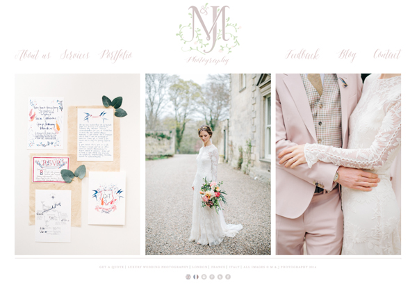
Another day, another logo design for a lovely wedding supplier. Jonny and Morgane of M&J Photos got in touch a few months back enquiring about a watercolour logo to go with their refurbished website.
It is such a pleasure to work with fellow wedding industry insiders as it is good to feel that our style is appreciated not just by our couples but by our peers too! This is yet another example of the diversity of watercolour, in fact, you’d be forgiven for not recognising such a medium in this design.
Jonny and Morgane were interested in the watercolour quality and gentle colour palette but with a crispness that a lot of watercolour work struggles to achieve. It was also important to keep the motif contemporary whilst still romantic – it is so easy to feel a bit dated when you’re arranging monogrammed initials as you can see below in my early tentative sketches! Pretty boring huh?
![]()
![]()
However dull these initial sketches were it was really helpful for Jonny and Morgane to be able to identify exactly what they didn’t want and we quickly moved forward to work on things a bit more like this:
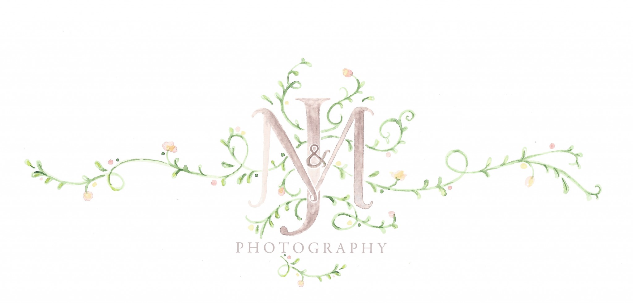
After a few carefully placed vines and experimentations with fonts, their logo was ready. It now sits pride of place above a gallery of their stunning wedding photographs. They’re attention to detail when working with me on this logo just shows me how fantastic they must be at their jobs! I would recommend them whole heartedly.