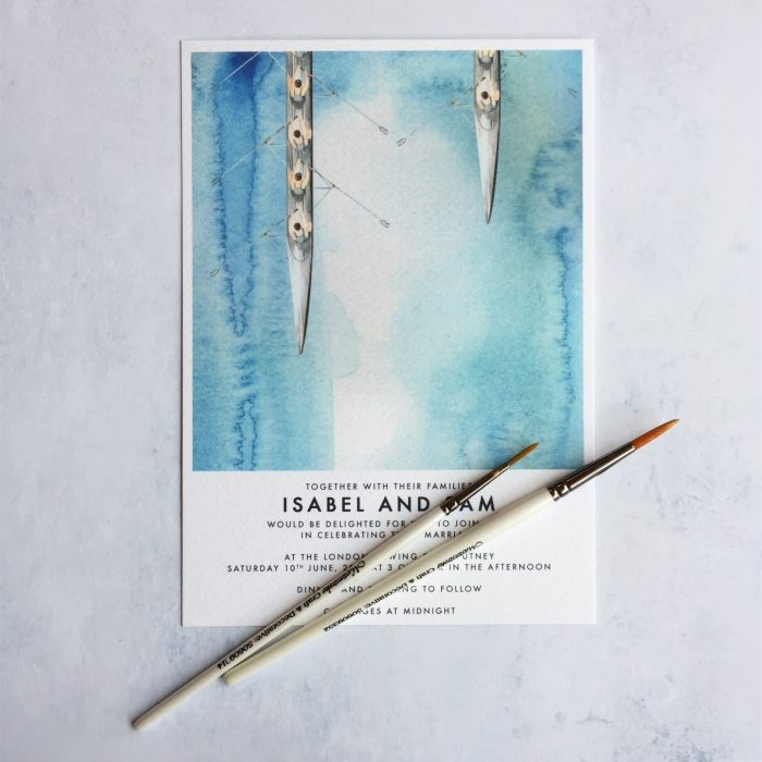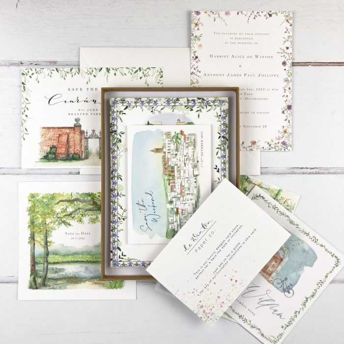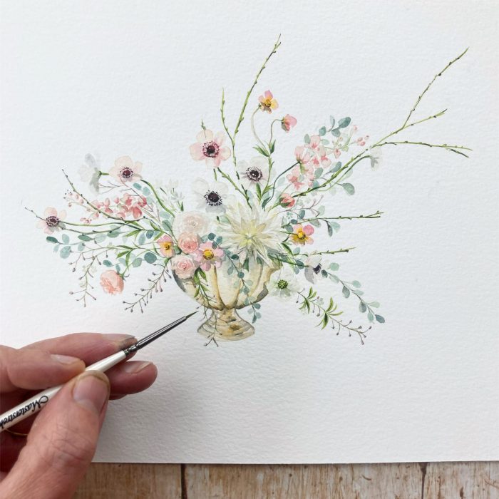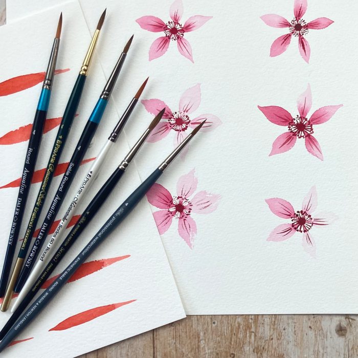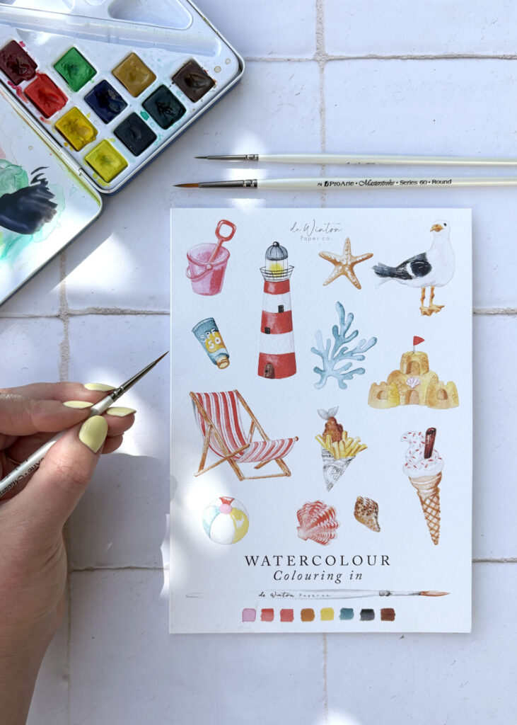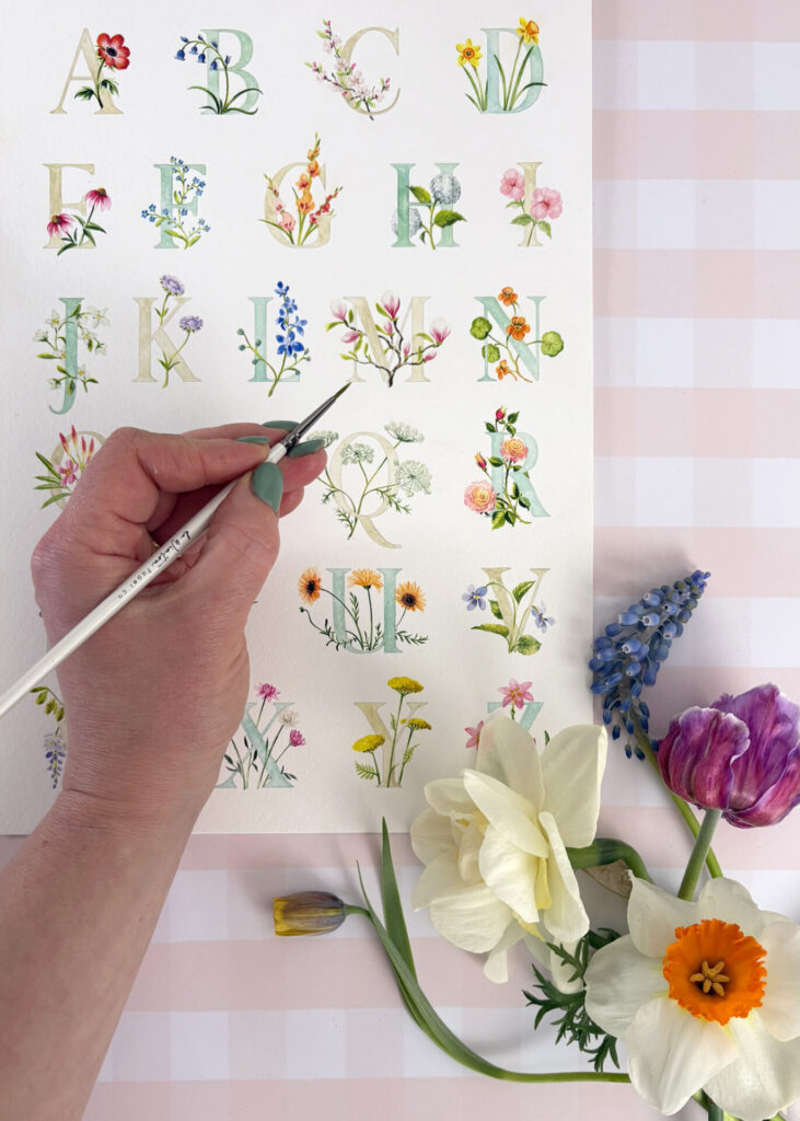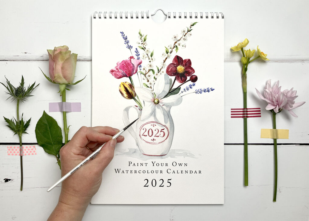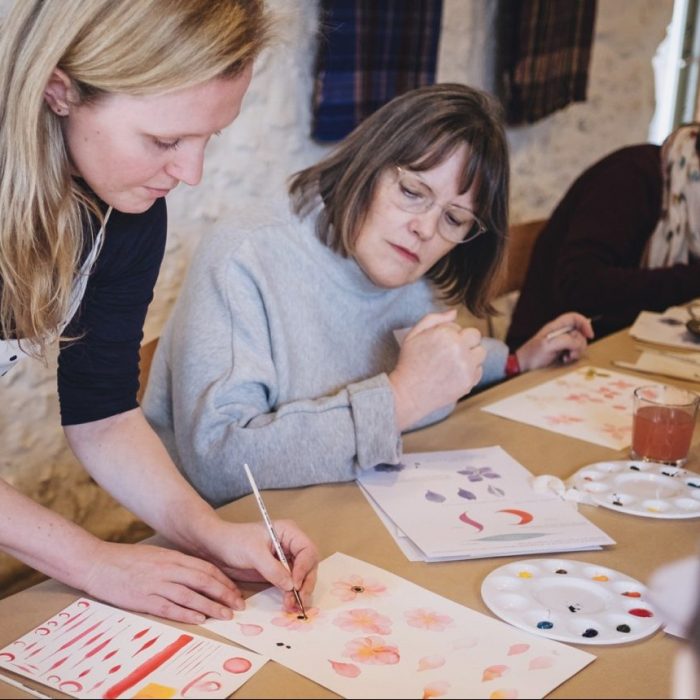
Watercolour is an increasingly popular medium. Nothing else can quite capture that watery beauty that sends the colours gliding into each other.
We have been designing logos for a while now at the de Winton Paper co. and were very excited to add blogger Rosie Ladkin’s logo to our portfolio.
Rosie and I went to school together and share a love of music, theatre, art and culture. She continues to live an extremely creative and exciting life and all of this is recorded on her blog, A girl on a Journey.
When it came to her design brief, this multitude of interests resulted in a lively, energetic series of ink pen illustrations. The illustrations give a great idea of Rosie’s interests and I like to imagine that she sits at a desk with all the illustrated items writing up her adventures.
One particular element was a cake illustration. I took total pleasure in drawing up a cake in the style of an Angels de Sucre towering layer cake.
Rosie wanted to be refreshingly bold with the watercolour element. We see an awful lots of ‘pale and interesting’ watercolour sploshes in logos. Don’t get me wrong, I’ve always been a fan, but I’m more keen on finding new ways to use watercolour. We ramped up the colour intensity and created a vivacious palette that still showcased the illustrations.
A quick bit of our trademark handwritten modern calligraphy and the logo was complete. It now sits pride of place on Rosie’s blog.
If you are interested in a hand drawn/hand painted logo for your business, email Harriet at [email protected] or call the de Winton Paper co on 01179733914.
